On 19 March, LSE LIFE held its very first Data Vizathon. Students were invited to apply their Tableau skills learnt in LSE100 and use their creativity to visualize data that can change minds and the world. This year’s theme was ‘London’s Air Pollution Crisis’.
Students were given data on air quality of London in Bloomsbury, Marylebone and around LSE, and had two hours to create their own dashboard. Afterwards, Ben Gloom, a well-known weather reporter considered the competing drafts and provided various insights on data visualization.
As a weather reporter, his job is basically to transform complex data such as changes in ocean current and wind into ‘whether you need to bring your umbrella with you tomorrow’. This is quite a challenging job sometimes!
As a participant myself, I found this experience rewarding and inspiring. It is definitely much more fun when you visualize data the way you want to instead of following fixed instructions printed on a sheet of paper. Also, my team was lucky enough to win a handy air pollution sensor! Now we can measure PM2.5 (a type of pollutant) while walking around!
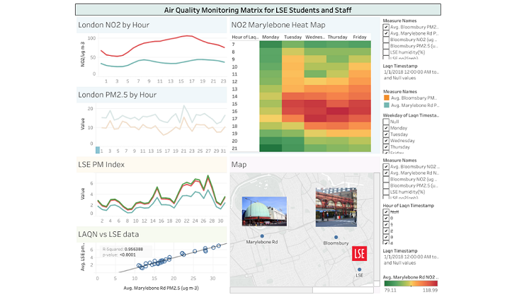
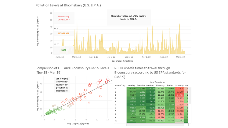
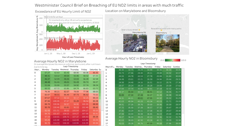
Below are some of the amazing and informative dashboards the participants created! This competition will likely to be held again next year. For those who enjouy learning Tableau skills in your LSE100 class, do join in next year and have a fun morning with your fellow Tableau enthusiasts!
Written by LSE Social Media Ambassador Hayli Chiu